Articles
To Enrich, Educate and Entertain
5 Tips for Professional Marketing Materials
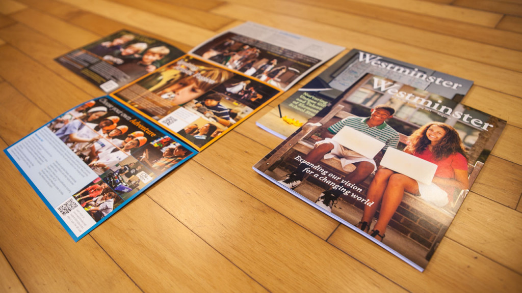
Make sure your branded print marketing is growing with your company.
Print is alive, well and contributes to the bottom line. Developing quality print marketing collateral is one of the best investments you can make in your brand. Your brand needs a great website and also great print marketing that informs your prospects on your strengths. Your brochures and print marketing speak for you when your sales team isn't present and there isn't access to your website. The team over at Entrepreneur.com composed this great list of Top 5 Tips for Professional Marketing Materials.
Every company needs "literature," printed pieces that do a careful and well-thought-out job of presenting its products and services: catalogs, newsletters, product sheets and brochures, letterhead, presentation folders, specification sheets, case histories or application sheets, special event brochures, annual reports, manuals, technical bulletins, posters, product insert sheets, labeling, recruitment materials and so on.
With the increased availability of powerful desktop publishing systems and software, many companies decide to meet these needs internally.
Resist this impulse. Your homegrown materials will betray their off-the-cuff origin to most of the people who read them. Appearance is reality in marketing, and you have to look as professional as you are.
Here are some tips in dealing with the literature needs you'll face as your company expands and grows:
- Get a logo and stationery package designed professionally. Do this, and don't change it for at least 10 years. Either hire an advertising agency to create it or a design studio/graphic artist. Don't try this yourself, no matter how artistic you consider yourself. A professional artist will make sure your stationery materials reflect your corporate personality, while maintaining a clean and professional look. They will look good in color and in black and white; they'll reproduce well in smaller sizes; they'll fax clearly; and they'll simply be more attractive than what you can expect to do yourself.
- Learn the principles of solid graphic design.Understanding graphic design is a lifetime's work, of course, but some reading and a sensitive eye can teach you a lot. Get hold of some graphic design books at a local bookstore and educate yourself. All your printed materials should follow fundamental design principles:
- Keep the look clean and simple. Don't overload the reader visually. Use a graphic grid to align the different elements in an orderly fashion.
- Use heads and subheads to lead the reader. When the reader turns the page, where will he or she look? Use heads and subheads to provide scanning points to keep the reader moving along.
- Avoid too much type. Pages filled with writing are not appealing to the reader. Break up the copy with photos, illustrations, cartoons, charts and so on.
- Use white space. Avoid a crowded look, despite the temptation to make use of every inch of paper you are paying for. White space serves as a visual frame for the rest of the content on the page.
- Stay with standard formats unless you have a good reason not to. All of us have grown accustomed to the standard 8-1/2"³ x 11"³ format for print materials. Even our filing systems are made for things that size. If you go with an unusual size, your pieces may not lend themselves to being filed easily for reference.
- Put a caption with each photo. We all want to know what we are looking at. And a caption gives you the chance not just to identify your product but to remind the reader of the benefit.
- Use charts and graphs rather than tables. A brochure is a visual document. Use graphics to boost visual interest and make numbers meaningful.
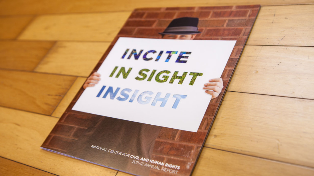
- Be sure your materials have a "family look." Every piece of literature doesn't have to look identical, but they should all look planned as a compatible unit. Imagine your literature laid out in front of you on a conference table. Does it all look like it comes from the same company? It should.
- Invest in good photography. Small companies sometimes scrimp on getting good photos of their equipment, their job sites, their equipment in use or their accessories and supplies. Strong, professionally done photography will set you apart from other small companies. Your customers want to be reassured of the quality of your product. Amateur snapshots give a very damaging impression of your professionalism. Good photography is an investment in your future.
- Appoint one person as lit boss. Your literature needs will be ever-changing, with trade shows, with new products and markets and with normal growth. You must have one person responsible for anticipating future needs, handling literature production and maintaining inventory. Untended literature grows increasingly less useful and more frustrating. Every new piece should have a written rationale, audience description and content outline, not unlike the rationale you develop for a piece of advertising copy.
Do you need help with marketing, design and print of your marketing materials? For over 30 years our team at Perfect Image has been a trusted resource to non-profits, higher education and marketing professionals. At Perfect Image were More than a printer and look forward to helping you develop stellar marketing materials. Get a Free Marketing Materials Estimate.

Perfect Image Insider
Sign up for valuable insights into print and marketing!
Get a Quote
Let us show you that we are your solution!


